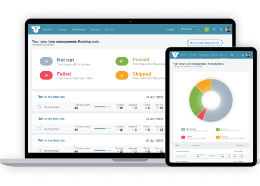
When starting the design process for our new navigation, we knew that each overhaul, streamline, and tweak would be guided by the mindset of our users.
TestLodge users are highly task-driven, so navigation reflects the way they choose to engage with their work, whether creating a test run or switching between projects. We have carried these same principles into page navigation and content hierarchy.
TestLodge boasts a wealth of features, which means that users often create a significant amount of content. Maintaining the favored status of our clean User Interface (UI), speedy access to features and content is facilitated by page navigation and accordions, sub-menus, and search. For spatial clarity, only key content is shown, with non-essential options and other content made visible only when required.
Overview of our Navigation
Let’s take a look at the main updates to our TestLodge navigation.
Task-driven primary navigation
Every TestLodge project has its own ‘task-based’ navigation that offers direct access to test plans, requirements, test suites, and test runs. Being able to create these documents is central to using TestLodge, so users must have access to them quickly from any page.

Project navigation
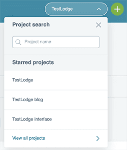
The primary navigation also supports quick project switching either through starred projects, a ‘view all projects’ link, or project search, which is now available from every page. It’s essential that “power users” managing many projects have the same great experience as a user with a single project.
Quick actions navigation
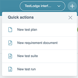
Our ‘Quick actions’ menu offers direct links to popular pages such as ‘creating a test run,’ so, with just a couple of clicks, users can start a task from any page.
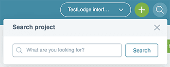
Project-wide search
Project-wide search can be accessed from every page within a project, enabling our users to find projects, and documents quickly.
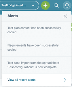
Alerts
Projects often involve many users and tests, so keeping everyone up to date through activity notifications is essential.
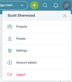
Quick account navigation
The profile account navigation provides direct routes to account-related pages, ‘projects’ and ‘people,’ as well as manage content such as ‘settings’ and ‘account details.’
Side account navigation
The account settings navigation demanded a different design to the horizontal project navigation because our users must be able to distinguish between Project UI and Account UI instantly. Understanding this hierarchy lets users focus on their tasks without unnecessary distractions.
Streamlined UI design
Our users were again central to our UI design thinking. Research confirmed a need for key content and features to be easily visible, while other elements were held off-page until required. In answer, users reach additional content and features through menu navigation and accordions. By reducing visible content in this way, our users can focus on their specific tasks without distraction. Because user behavior changes over time, our ongoing user research will allow us to continue evolving the UI.

Consistent, distinctive navigation styling
User orientation is a key priority, with clear headings, selected states, consistent styling, and prominent Calls to Action (CTAs). Our users expect to know where they are, what they can do on the current page, and where they can go next. In all this, TestLodge delivers.
There is a clear distinction between primary and secondary navigation, which guides users through the application without conflicting options. Our navigational links are also styled blue consistently, making it easy to identify available options and move from page to page.

Powerful filtering
Designing a UI that offers a great user experience to both single project users and power users is highly essential. Powerful filtering is key to achieving this, allowing users to find specific tests, whether through status, assigned member, or date created. These filters are available throughout TestLodge.

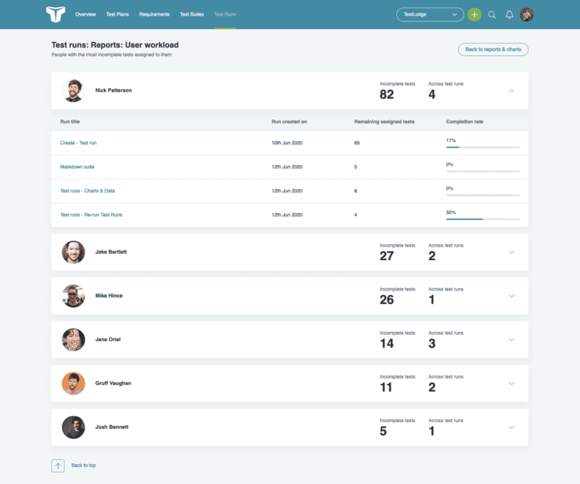
Managing your team’s workload
Managing the workload of many users and tests can be a challenge, but TestLodge provides a helpful summary to show vital information such as completion rates, test run numbers, and offers direct navigation to specific test runs.
Powerful customisation
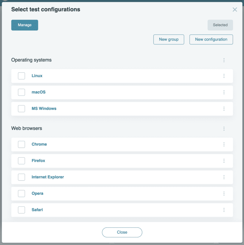
Every user has their own requirements so TestLodge users can create their own custom fields and test configurations to ensure the tests are as detailed as possible, as well as being manageable.
Designing for the Future
Distinct from many other applications, TestLodge designs for the present and the future. This approach allows us to add new content as required without impacting the user experience. This forward-thinking agenda sets us on the right good path for the tool’s continuing improvement.
If you are not a TestLodge user already, why not give us a try and sign up for a free 30 day trial.
About the writer
Scott Sherwood
Scott Sherwood is the Founder and Director of TestLodge, which he built after noticing a lack of straightforward, easy to use test management tools available online.
All Scott Sherwood's articles
