What Is Usability?
Before we start to talk about Usability Testing, it’s essential to first understand what we are referring to when we say usability. When a new user first interacts with a product, he or she does so with a goal in mind – in fact, the only reason they are there is because they want to achieve something, and the product they have chosen offers a way to achieve it. Usability describes the level of ease with which a system allows a user to get to that goal.

Picture a food delivery startup. Their product allows people to order food from their smartphones or computers, then receive that food wherever they are.
A new user was probably drawn to open the startup’s app as the result of marketing efforts. The value proposition of using a simple app to order food was promoted to them so therefore, the user is expecting to be able to order food very easily.
The journey starts the moment the app icon is tapped, and concludes the moment food actually arrived.
Determining the food delivery app’s usability means finding out how easy is it for the user to get their food. We are talking about the total level of friction involved in that process.
If the product – or in this case, the app – has a very confusing and hard to negotiate user interfaces, over-complex task flows, poorly constructed error messages or a bad performance, for example, there will be a lot of friction and the result will be that the user will have a hard time achieving his goal, and will be unlikely to access the app again. Long story short – poor usability.
On the other hand, if the contrary happens and there is good learnability, well-crafted user interfaces, straight-to-the-point task flows with good error messages, and good performance (among other positives), then the user will get to their goal with less friction more easily and faster. Long story short – great usability here.
What Is Usability Testing?
When designers and developers are working on a product, they become highly involved in the process, and that bias is usually still present when they conduct software testing for the website or app themselves. It’s borderline impossible for the same designer who designed a product to see all of its flaws, after weeks and months thinking about it everyday. Because identifying those flaws is critical to success, what should be done? The answer is Usability Testing.
Usability Testing is an attempt to evaluate a product’s usability. In the majority of cases, the best way to do this is by having users test your product while observing their behavior as they do so.
For example, if you are designing a website for a supermarket, and that website allows users to do their groceries online, the best way of testing your design is by having a user proceed through your product as you watch them trying to buy their groceries.
If this works out successfully, the user will probably flow very well through your interfaces and end up achieving their goal. On the other hand, if it wasn’t successful, then most likely they will stumble across multiple, faulty elements and you will be able to observe them being confused, trying to find out what to do next, or even asking questions such as “What do I do now?”
The goal with Usability Testing is to recreate real world scenarios where the user will be actually using your product, then by observing their behavior you will be able to understand what could be done better. We’ll go further in depth later about how the tests are actually conducted.
Why Does It Matter?
The case for Usability Testing is very clear. Let’s go back to the example I used in the beginning: A food delivery startup. The food delivery market in tech is very crowded right now, with multiple startups fighting amongst themselves. It’s a war, and having a solid product is an essential part of the war strategy.
To be able to attract a customer by either bringing him or her to their website or to get them to download the app, a great deal of money will have been spent because the development of apps is becoming increasingly expensive. In a lot of cases, that money will only be returned (and profit achieved) through not the first, but the user’s follow-up purchases. If he or she opens their product with the goal of ordering food but is welcomed by bad interfaces, poorly constructed task flows and other usability problems, they will most surely leave and go for one of the dozens of other competitors that are also trying to attract them. If they encounter a better experience elsewhere, they won’t bother coming back.
On the other hand, if the experience is a positive journey thanks to a well designed, highly usable app, they will most likely stick around and use it the next time they want to order food. Competitors? No need to even think about them, since the hungry user’s needs are being fulfilled really well by your product.
The more usable your product is, the more retention, word of mouth and customer satisfaction you will achieve. Therefore, usability is directly correlated to profit. Since Usability Testing is one of the most efficient ways to identify how you can improve your product’s worth to the consumer, the case for usability testing is a straight case for ensuring your customers will be satisfied, and because of this, you will thrive as a business. Plain and simple.
The alternative – designers making guesses about user behavior, launching products that haven’t been tested by real users, or not making changes in already launched products – results in bad retention, poor satisfaction, and consequently, less profit.
How Is Usability Testing Performed?
Goals, Hypothesis and Method
The key to major success is right here: Before you start the testing, clearly define the goals. Why are you conducting these tests in the first place? What motivated your organization or team to do this, and what are you looking to achieve? What will define a successful test for you? Also, think about the hypotheses you have. Where do you believe you’ll encounter the most issues and why? Understanding and clearly stating the foundations is absolutely essential.
You should also lay down whichever specific methodology you intend to follow, both for making the running of tests easier and for facilitating replication later down the road, in case that becomes necessary for any reason.
Recruiting
As I’ve mentioned previously, the best way to test your product’s usability is to test it with real users that have had no part in the design or development process. Therefore, actually recruiting those users is a crucial step. Here, it is vitally important to remember that whoever is testing your product should fit your target audience. If you are building something for seasoned lawyers to use, it’s not useful to have junior engineers testing it. Sometimes, it’s a challenge to recruit – but it is a key step.
When recruiting, quality matters more than quantity. It has been recognised that usually 3 to 5 subjects will be able to identify a good portion of the usability issues in your website, especially if they fit your expected audience.
Defining Tasks
It isn’t as simple as asking people to “use your product” and then watch magic happen. To get the best results – that is, to observe them use it as they would in their lives – you should ask them to complete specific tasks. For example, if you are working on a flight deals website, one task could be “Book a flight from SF to NY, for next Tue returning next Fri”. Notice how the task gives actionable info, but isn’t telling or giving tips: It isn’t saying, for example, “Use the bottom-right corner box to book a flight.” The brief is instructing, but not hand-guiding the user.
Defining good task scenarios is a subject in itself, and it is an essential one. Poorly written tasks can make your testing ineffectual, but well written ones will help you to achieve the best results.
Running The Tests
To actually conduct the testings, you will want to have the users using either the same or a similar device to the one they use in the real world. For example, if one of your subjects uses Android, don’t ask him to use the iOS version of your app. You should aim to visually record your sessions with the user using the app if possible, because of their facial expressions. Appoint an interviewer who will ask them to perform the task scenarios while taking detailed notes. This step varies a lot from company to company because you might have fully remote testings in one session and research labs being used in another.
Reporting And Fixes
After you’ve finished conducting the tests, revisit the interviewer’s notes and rewatch each test several times. Another key to success? Summarize the findings in a concise way, usually pointing to what you discover were the main pain points and note what the user’s reaction and behavior were. Successfully written reports about the tests conducted will allow your team to work on the findings to improve the product.
In regards to fixing the problems found, it’s usually best to aim to fix the ones that require the least effort but deliver the most benefits, but making that choice will depend on your particular context and your product’s specifics.
Overall, this is the Usability Testing process. Again, it varies from organization to organization and product to product, but in general this should give you a good idea.
Let Me Give You A Real World Example
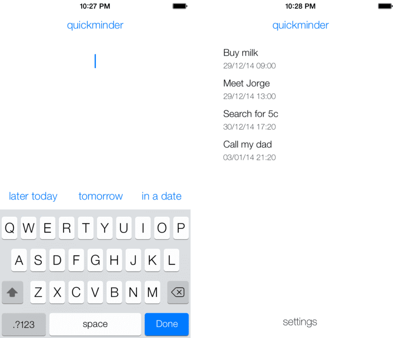
A while ago, I was working on a personal side project in partnership with a friend who is an iOS developer. We had a very simple idea for creating a reminders app for iPhone that would be much more straightforward than the default Reminders app, which had just been launched and still had a lot of issues.
We wanted to make the process as simple as the person typing what he or she wanted to be reminded of, then having them select a predefined date that our system would calculate based on a variety of factors, tapping “done” and that would be that.

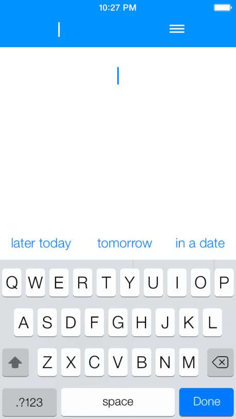
Those aims were the bare bones. Other than that, we also had to have a basic list view to show the user’s reminders, and include options to edit those reminders and tweak overall application settings. We decided to go with an overly-minimalistic solution to access that view; the users would tap a label then open up the menu, then tap an icon and go to the list. It made a lot of sense to us – and to the early beta testers (that were deeply involved in the process).
It turned out that this solution was way too simplistic, it failed to include enough signifiers and this heavily impacted usability. How did we find that out? By conducting Usability Testings.
We used a tool that allowed us to do remote testings and tested it with users who were interacting with our app for the first time.
The feedback we received was incredibly insightful: No one actually knew how to open up the menu or, much worse, that opening the menu was even possible. We discovered that the icons were way too abstract – we used a sandwich-like menu when using a sandwich menu was far from being the standard – to signify their functions and then, going to the menu list, it was not clear how to actually edit the items. Overall, there were multiple issues.

Conducting Usability Testings helped us identify – and later, fix – those problems. I decided to use this example to show how even in a side project without any monetization concerns there is still a huge case for conducting testings. That case would have gotten even stronger had I used an example of a client project.
Closing Thoughts
To wrap it up and to reiterate, testing your solution with actual users is the most effective way of identifying where your main usability problems are. And launching a faulty, problematic product that isn’t useful simply isn’t a good idea – even if you are not going to monetize it, it means you are wasting your time building something no one will use.
The goal here wasn’t to teach you specifically how to conduct testing – instead, it is an introduction to the topic. From here, do your own research and, in case you aren’t doing usability testings yet, make sure to implement them in your next project. You will see the results for yourself.
About the writer
Fabio Muniz
From Brazil, Fabio is a co-founder of Awari, an education startup offering tech courses led by mentors.
All Fabio Muniz's articles
