We interact with multiple devices to consume web content every day. Mobile phones, desktops/laptops, tablets, phablets… the number of devices at our disposal has grown astronomically. As consumers, this is great. We have the freedom and flexibility to connect anytime, on any device. But it’s a nightmare for web developers, designer and testers.
Software teams are required to find ways to build and design to accommodate all of these device and browsers. A responsive website does just that – responds according to the device it is being viewed on.

What is Responsive Web Design?
Responsive web design is an approach to designing and developing in a way that responds to the user’s behavior and needs. In other words, responsive design ensures a website is optimized for all devices. Ethan Marcotte first introduced the world to the concept of “responsive design” in 2010. The goal of responsive web design is to have one website that displays beautifully across all browsers and devices.
Responsive web design means you’re building your website with the understanding that it could be viewed on any browser or device. You can’t assume your CSS and Javascript will just magically work on all devices, you need to plan for this, and then you need to test it.
Responsive Website Testing Tips
If time and budget were unlimited, we could test on all devices and browsers all the time. But the reality is – well – this just isn’t reality.
10 Generic Responsive Website Checks
Here are some of the basic tests you’ll want to cover in your tests across devices/browsers:
- Does the website load? – You’d be surprised at how often this one gets missed. Don’t be the website that needs to be running on a certain browser to work.
- Is the clickable/tap-able area suitable? – There’s nothing more frustrating than tapping a button and seeing nothing happen. With all of the different touch screens available today, you need to make sure the device responds to “tap” actions accordingly.
- How’s the padding around the edges? – Keep an eye out for padding discrepancies across devices.
- Is the text aligned properly? – You may need to target certain text elements differently across devices.
- Is the font rendering the same across all browsers? – Fonts introduce a whole new world of problems. Make sure your fonts are readable across all devices.
- Are buttons/elements missing? – It’s very possible your CSS will need to be modified in order for certain elements to appear on all devices/browsers.
- Is the page content aligned in the center? – Similarly, some devices may have alignment issues that need adjustment.
- Is each breakpoint displaying the most important elements? – Defining breakpoints is really important and ensures all of the important stuff is visible when your site is viewed on a smaller screen.
- Are there any javascript errors? – Checking for these surface-level errors will solve many other problems right away.
- Does dynamic data appear properly? – Make sure CSS and HTML tables respond properly and include dynamic content.
Feeling overwhelmed? Don’t be afraid to bring in your design team for a second set of eyes. After all, they will have a better sense of what types of things aren’t looking they were they originally intended to.
Prioritizing Devices & Browsers
Don’t just start grabbing devices and testing. Test with a purpose. Understand your audience and prioritize devices and browsers based on that information. Use data to drive these decisions. Google analytics will give you a basic breakdown of how people are viewing your website (browser, tablet, mobile). You can take this even further by using the mobile device report to see which types of devices are hitting your site, and even the screen size of those devices.
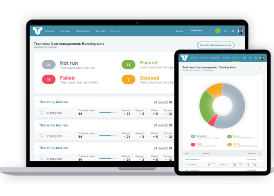
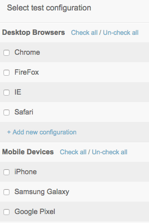
Once you’ve nailed down your list of devices and browsers to test, you’ll need to track the results of each test. TestLodge can help you do this by creating multiple “test configurations” for each device/browser.
Responsive Website Testing Tools & Resources
For every device you want to test, you need to get your hands on the device. Buying a bunch of devices can get expensive though. Especially considering all the new phones, tablets and desktops that hit the market every year. That’s why communities have come together and emulators have been developed… to help solve this problem. Here are some tools and resources to consider as you test across devices:
- Browserling – Live cross browser website testing allowing you to change screen size for responsive testing.
- Google Dev Tools Device Mode – allows you to emulate your website across different screen sizes and resolutions.
- Responsinator – gives you a quick idea of what your website will look like on popular apple and android products.
- Labcase – a service to have physical devices shipped to your office for testing.
- OpenDeviceLab.com – a grassroots movement enabling developers and testers to access a broader variety of devices.
- LabUp! – helps people around the world establish nonprofit open device labs in order to make a wide range of devices available for testing.
Take a look at our cross browser tools list for further tools that can help with responsive browser testing.
Finally
Responsive website design has introduced some complexities in the world of software development. It keeps us on our toes as we write and design for the web. By testing for responsiveness, you’ll ensure your users are set up for success when they access your website on any of their devices.
About the writer

Jake Bartlett
Jake Bartlett lives and works in Nashville, Tennessee. He has a background in software testing, customer support, and project management.
All Jake Bartlett's articles