According to W3C (World Wide Web Consortium), the body that sets industry accessibility standards, the term “Mobile Accessibility” refers to websites and applications being more accessible to people with disabilities, while being used on mobile devices. They address the accessibility issues of people using a wide range of devices to access and interact with the web, such as phones, tablets, smartwatches, TVs, and more.
In this article, we highlight four ideas that you may not have considered when developing a mobile application. We place a particular slant on testing and reviewing your application with people with disabilities in mind, rather than only performing mobile accessibility testing as an afterthought, just before the product is launched.
1. Your mobile app user demographics will definitely include people with disabilities
When designing your mobile application or mobile web app, you need to consider the wide range of disabilities, physical limitations, and differences, that people may be living with. These can include:
- Low vision, partial or total blindness
- Color blindness and the inability to see color
- Dyslexia and other cognitive differences that can affect the readability of a mobile site or application
- Motor skills disorders, arthritic, or other hand/finger joint issues that impair dexterity
- A combination of these issues – which can make addressing accessibility even more of a challenge!
Your application may be specifically designed for a certain type of person who you would not typically consider to have disabilities, such as a fitness app user. Even so, you should still consider that they may be living on the spectrum of a physical ability, such as a visual impairment. It may not impact the core activities you expect your users to be carrying out – such as running, or it might be a motor control disability that may affect a person’s hands and dexterity – because people with disabilities can still enjoy physical activities, even if they are limited in some areas.
An important statistic to remember when designing and testing mobile apps for accessibility, is that 82% of people who use screen readers will use it on a mobile device. This means there is a good chance that your application will be accessed and used by people with a visual impairment of some kind, whether or not they are your “intended” audience.
2. Your app doesn’t need an “accessible mode”
This might sound counterintuitive, given the nature of this article, but hear me out.
Ideally, your mobile application should work well for everyone, regardless of ability, impairment, level of motor function and dexterity, etc. Your team should strive to consider all user types and address accessibility issues and how to eradicate them at the conception stage when each feature is being designed. For example, a feature that involves a user dragging an item into a box to accomplish a task can be tweaked to remove the dragging feature, in consideration of people with motor difficulties who might find this physical action difficult. The task will now be achieved by the user clicking on the item to highlight it, then clicking on the destination box to move it. We can see the exact same task has been carried out, but now with potential barriers removed.
Having an inclusive design mindset is how digital product teams produce excellent and accessible products that just work.
3. Your touch navigation will probably exclude some people
Continuing on from the previous point about not having a dedicated accessible mode, it’s a good idea to offer your users more than one way to complete a task, especially if this task generally requires some kind of fine motor skill or specific gesture.
For example, the popular dating app Tinder is known for the feature of swiping left or right to reject or accept a potential match. But swiping right isn’t the only way to find love on this app, you can also tap on the little love heart below your future spouse’s picture. Similarly, Instagram allows people to like a photo by double tapping an image as well as by tapping on the heart icon below that heavily filtered sunset photo.
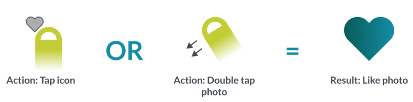
The reason for having a multi-pronged approach is to ensure that people with differing levels of ability can all achieve the same goal – if a user cannot swipe, they can tap, if they struggle to tap small icons, they can swipe.
It is also important to consider the click size, or “hit area” of a button for similar accessibility reasons. Make the buttons easy to tap and provide enough space around each hit area.
At the planning stage, ask yourself, “Will a user with a hand disability be able to carry out this task by following the process I have designed for them? If not, how could I implement an alternative secondary method of interaction that covers all bases?”.
4. Both your device and those of your users already have inbuilt mobile accessible tools
Mobile devices generally come with native assistive features such as VoiceOver (Apple/iOS) and TalkBack (Android) that will allow users who are blind or visually impaired to interact with devices. These inbuilt features provide spoken, audible, and vibration feedback to help people with disabilities engage with, and experience, the web and applications without having to see the screen.
These native features can also be used to test the mobile site or application you are developing. And lucky for you, there are many free mobile testing tools you can add to your mobile accessibility testing toolkit. Here’s a few:
- Accessibility Inspector in Xcode – A tool from Apple that you can download from the Mac App Store for free. This accessibility inspector presents a utility window that displays the properties, action methods, and position in the accessibility hierarchy of the object currently under the mouse pointer. This can be useful for testing how screen readers may interact with the onscreen elements.
- Accessibility Scanner – This is a tool that suggests accessibility improvements for Android apps that don’t require technical skills. It suggests improvements such as enlarging small touch targets, like the “hit areas” I mentioned previously, increasing contrast, and providing content descriptions, so your app can be more easily used by people with accessibility needs.
- IOS Color Contrast Checker – Color Contrast Checker is a tool for measuring the contrast between two colors in a screenshot or mobile website, helping to ensure your app meets the internationally recognized recommendations in the Web Content Accessibility Guidelines (WCAG) 2.0.Color Contrast.
Conclusion
There are many tools and techniques that can be used to test and improve your mobile products and web apps, but the most important ingredient is the mindset that you and your team have. If you approach developing your product with an attitude of Inclusive Design, you will likely tackle many accessibility concerns before they have a chance to become problems that need fixing later down the line in your app’s development cycle.
About the writer

Will Saunders
Will Saunders is a creative designer with over 10 years experience in the field and founder of Good Will Studios.
All Will Saunders's articles